What’s New in Google Wallet Passes in 2026? Redesign and Updates
What Google Wallet's 2026 redesign, pass updates and image guidance mean for businesses issuing digital passes.
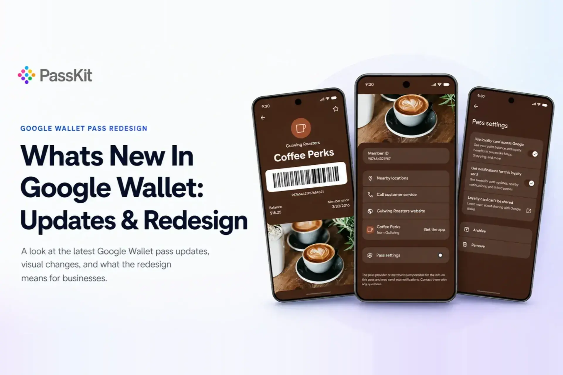
Google Wallet passes are changing as part of two related updates in 2026. The redesigned Google Wallet app is available, although availability may vary by device, account and region. It introduces a more compact pass library, favourites and improved search. Google has also previewed a broader redesign of individual passes, including edge-to-edge layouts, larger hero images, clearer actions and dedicated pass settings.
Alongside these interface changes, Google has updated its public guidance for pass imagery, background colours and content length. Existing passes are expected to remain compatible, but businesses should still review whether their current artwork, information and actions will look their best in the new experience.
Last updated: 27 July 2026. This article distinguishes released Google Wallet changes from features currently shown in developer and partner previews.
Google Wallet Pass Redesign 2026 at a Glance
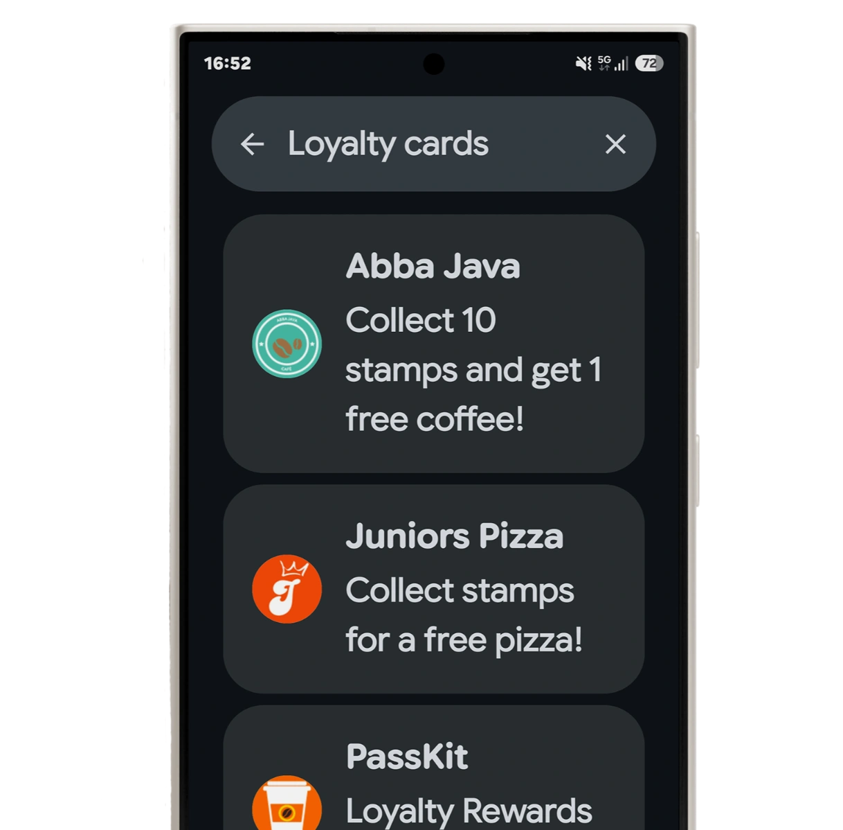
Google Wallet’s pass experience is changing at two levels. The redesigned Google Wallet app is available, with quicker access to favourite passes and a searchable View more hub.
Google has also publicly shown full-screen experiences for time-sensitive passes, while a broader component-based redesign of opened passes remains in partner preview.
| Update | Current status | Why it matters |
|---|---|---|
| New Wallet home screen | Available on Android, with availability varying | Passes appear in a compact two-column layout |
| Starred passes | Available on Android, with availability varying | Users choose which passes remain prominent |
| Searchable View more hub | Available in the redesigned app | Users can find passes beyond the home screen |
| Full-screen time-sensitive passes | Publicly announced | Boarding passes and urgent information use more of the display |
| Component-based rendering | Partner preview | Pass information appears in richer visual sections |
| Updated hero-image guidance | Google documentation updated 20 July 2026 | Google now recommends a full-width 1032 × 812px image |
| Dedicated Pass settings | Partner preview | Administrative controls move away from the main pass |
| Backwards compatibility | Partner preview | Existing passes are expected to continue working |
The app changes and updated image guidance are publicly documented. The component-based renderer, dedicated settings page and broader backwards-compatibility commitment remain partner-preview information until Google publishes final rollout guidance.
The Google Wallet App Redesign and Pass Redesign Are Different
The Google Wallet app redesign changes how users find and organise passes, while the Google Wallet pass redesign changes what users see after opening one. This distinction explains why users can already see a new Wallet home screen even though the broader redesign of individual passes remains in preview.
The Google Wallet app redesign
Google’s release notes describe a redesigned Wallet interface focused on quicker access, search and discovery. In the updated Android app, passes appear in a compact two-column layout, users can star the passes they want on the home screen, and the searchable View more hub provides access to the complete pass library. Google Wallet Help now documents the View more search experience.
The Google Wallet pass redesign
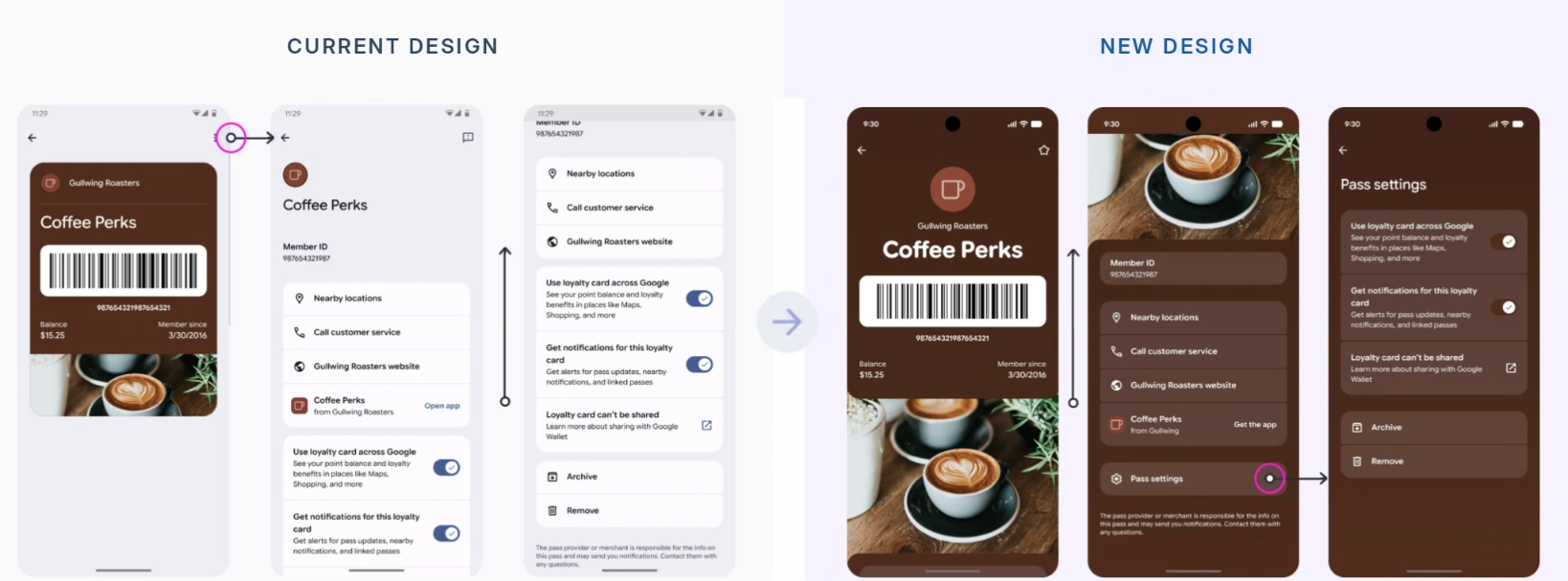
The pass redesign changes the experience inside an opened loyalty card, membership card, coupon, gift card, boarding pass or ticket. Partner previews show edge-to-edge background colour, larger titles and hero imagery, information grouped into components, clearer customer actions and a dedicated settings page. The broader experience remains in partner preview.
| Area | App redesign | Pass redesign |
|---|---|---|
| Where it appears | Wallet home screen and library | Inside an opened pass |
| Main purpose | Organisation and discovery | Presentation and interaction |
| User impact | Grid, favourites and search | Richer full-screen experience |
| Business impact | Pass visibility and recognition | Artwork, hierarchy and actions |
| Status | Available on Android, with availability varying | Broader version remains in partner preview |
This means businesses need to consider two separate questions: whether customers can easily find the pass in Google Wallet, and whether the opened pass is visually and functionally ready for the new experience.
What Is Changing in the New Google Wallet Pass Design?
Google’s public documentation does not yet provide a final interface specification or migration guide for the redesigned individual-pass experience. However, its current design guidance and work-in-progress interface testing point in the same direction: opened passes are becoming more visual, colourful and information-rich. The final layout may still change or vary by pass type, device and rollout stage.
More pass information appears on the first screen
In the current interface, some identifying information and controls are reached through the three-dot menu. Android Authority’s testing found Google displaying more information immediately after a pass is opened, including the pass name, identification number, date added and shortcuts to related settings. The report also cautioned that the tested interface appeared incomplete and had not reached the wider user base.
Google Wallet pass templates already allow issuers to define the programme title, branding and structured rows displayed across a pass. These templates are configured through the Google Wallet API using Passes Classes and Passes Objects. This suggests the redesign is primarily changing how existing pass content is presented rather than introducing an entirely separate pass format.
More colour and stronger branding
Google’s tested design gives the pass graphic more space in the upper part of the screen and uses its dominant colour behind surrounding information. This creates a more connected visual experience than the current presentation, where the pass graphic is more clearly separated from the wider Wallet interface.
Google already allows issuers to set the pass background using hexBackgroundColor. When no value is supplied, Google can derive a dominant colour from the logo. Its current guidelines also warn against highly saturated neon colours because they can reduce readability.
Updated Google Wallet hero image requirements
Google’s current guidance states that class.heroImage appears as a full-width image beneath the pass data. It recommends a 1032 × 812px image at approximately 5:4, with high-resolution photography or illustration, around 20dp of breathing room at the top and bottom, and no embedded text. Google may display category-specific fallback artwork when no hero image is provided.
Google has not publicly documented how older, differently proportioned images will be cropped or scaled. Businesses should therefore review existing artwork rather than assume it will make effective use of the larger format.
Pass links may become more prominent
Google Wallet already supports tappable links to webpages, Google Maps locations, telephone numbers and email addresses, as well as deep links to an issuer’s app or website. Google has not yet confirmed the final position or visual treatment of every link in the redesigned pass interface.
Pass details and settings become easier to reach
Public interface testing shows settings shortcuts and additional pass information appearing directly on the opened-pass screen. The familiar three-dot control was replaced in testing by an icon that opened a page resembling the current details view, although Android Authority noted that the behaviour may reflect an unfinished implementation.
| Element | Current experience | Publicly documented or tested direction |
|---|---|---|
| Overall layout | Pass graphic within the Wallet interface | More connected, colourful pass screen |
| Branding | Colour concentrated around the pass | Pass colour extends across more of the screen |
| Hero image | Existing artwork varies | Full-width 1032 × 812px image recommended |
| Information | Some details behind expanded views | More information visible on the first screen |
| Links | Supported as tappable rows | Final redesigned placement remains unconfirmed |
| Settings | Commonly accessed through the three-dot menu | More visible settings shortcuts |
For businesses, the direction is clear: imagery, colour contrast, concise information and useful links will have greater influence on how Google Wallet passes are recognised and used.
Will Existing Google Wallet Passes Still Work?
Existing Google Wallet passes are expected to continue working when the new design rolls out. Current partner-preview information describes the transition as backwards compatible, while Google’s public documentation continues to use the existing Passes Class and Passes Object model.
Do existing Google Wallet passes need to be reissued?
Existing passes are not expected to need reissuing solely because of the redesign. The partner preview describes the transition as backwards compatible, so existing barcodes, customer details, balances and membership information should remain available as Google introduces the new presentation.
Google’s public documentation also continues to use the existing Passes Class and Passes Object model. Shared Class updates automatically propagate to the associated passes already held by users, while individual Objects can continue to be updated separately.
How is PassKit supporting existing programmes?
PassKit is introducing backwards-compatible support in its web app so businesses can continue managing existing Google Wallet programmes during the transition.
Google controls how passes are rendered inside the Google Wallet app. PassKit controls how customers create, distribute, update and manage Google Wallet passes through its platform.
Will existing passes look their best automatically?
Not necessarily.
Backwards compatible does not mean visually optimised.
Businesses should review:
- Hero images created for older proportions.
- Long programme names and field values.
- Crowded pass layouts.
- Logo and background contrast.
- Text embedded inside images.
- Outdated website, support and location links.
Google has not yet published complete migration guidance explaining how older images will be cropped or scaled, whether every pass type will use the same layout, or whether all devices and regions will receive the redesign simultaneously. Existing passes should remain functional, but their visual presentation should still be reviewed before the wider rollout.
When Will the New Google Wallet Pass Design Roll Out?
Google has not announced a public release date for the broader redesign of individual Wallet passes. The separate Android app redesign is already available, with Google confirming a refreshed Wallet interface focused on quicker access, search and discovery.
The redesigned screen shown after opening a pass remains in testing. After an earlier preview in Google Wallet version 26.12, Android Authority found a more polished version of the colourful interface in version 26.18. The publication reported that the design appeared closer to completion but was still not available through the normal Wallet experience.
Google has not published a rollout window, and the final appearance and availability could still change.
What the Google Wallet Redesign Means for Businesses
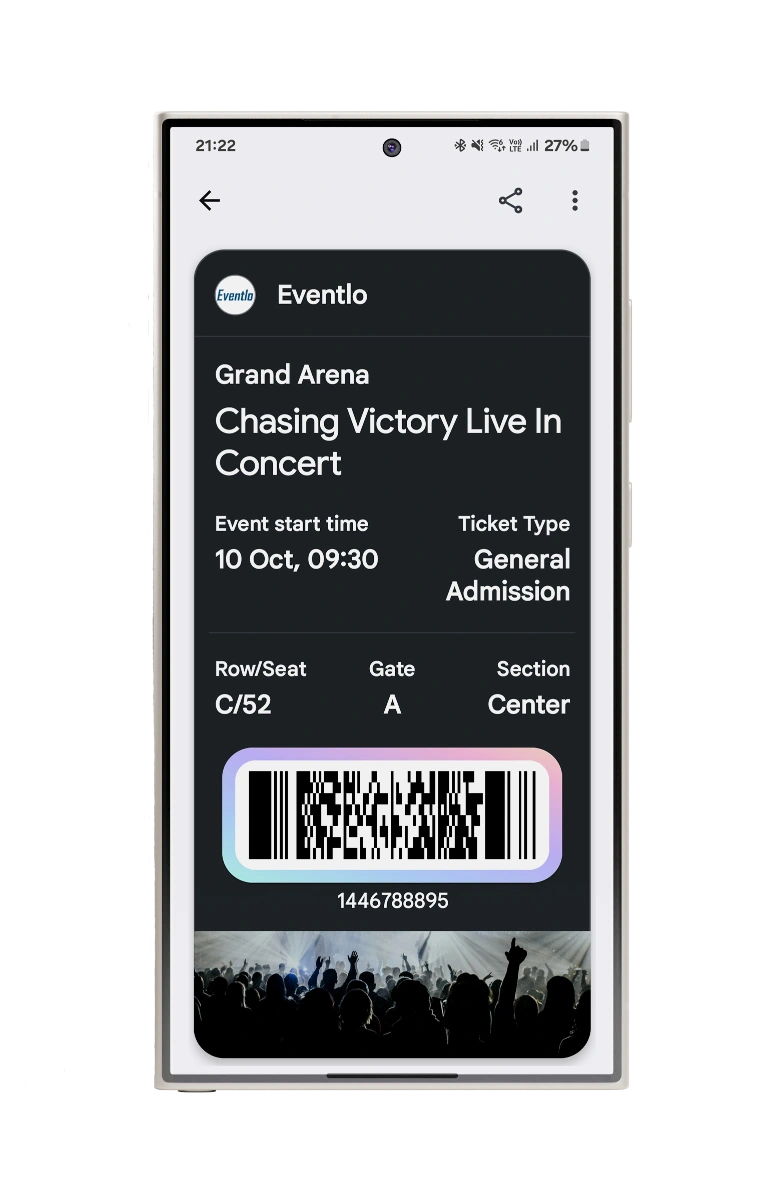
Old Version of google wallet ticket
For businesses, the Google Wallet redesign makes pass recognition, information hierarchy and continued usefulness more important after a pass has been saved.
Organisations issuing digital wallet passes such as loyalty cards, membership cards, offers, gift cards or tickets need to consider how customers discover, understand and use each pass throughout the customer relationship.
Recognition starts before the pass is opened
The redesigned Google Wallet app gives users more control over which passes remain prominent through starring and home-screen ordering. Other passes remain available through View more, but businesses cannot force their pass to stay on the home screen.
Programme names, logos and background colours therefore need to remain recognisable within the compact grid. Customers should be able to understand what a pass represents and why they may need it before opening it.
The first screen should have one clear purpose
The redesigned individual-pass experience places more information, branding and imagery directly in view. Businesses should prioritise what customers need at the moment they open the pass rather than filling every available area.
For a loyalty card, this may be the current points balance and next reward. For a membership card, it may be membership status and expiry date. For an event ticket, it may be the event time, venue information and barcode.
A clear information hierarchy helps customers find what they need and complete the intended action faster.
A saved pass still needs a reason to be used
Saving a pass is the beginning of the customer relationship rather than the final outcome. Customers have a stronger reason to return to passes that continue providing current and useful information.
Businesses can update shared programme information and customer-specific pass data after installation. This makes it possible to keep balances, rewards, membership details, event information, artwork and links relevant without asking customers to save a replacement pass.
The strongest programmes will treat the pass as an ongoing customer touchpoint rather than a static digital copy of a plastic card.
Visual design must support the customer task
Larger hero imagery and stronger use of background colour create more opportunities for branding, but visual design should not compete with the pass’s functional purpose.
Artwork, programme titles, fields, links and barcodes should work together as one experience. A pass may look impressive, but it still fails if customers cannot identify their balance, find the required action or scan the barcode reliably.
Businesses should review which existing programmes would benefit from clearer branding, a stronger information hierarchy and more useful customer actions.
PassKit customers can continue managing their current programmes while preparing them for a more visual and customer-controlled Google Wallet experience.
Frequently Asked Questions About the New Google Wallet Pass Updates
Why do I not see the new Google Wallet pass design yet?
Google has not announced a public release date for the redesigned individual-pass experience. The newer Wallet home screen, favourites and search may already be available while an opened loyalty card, membership card or ticket still uses the current layout.
Availability can differ by Google Wallet version, Android device, account, region and pass type. Updating the app does not guarantee immediate access to an interface that is still being tested.
Can users choose which passes appear on the Google Wallet home screen?
Yes. Users can star the passes they want to keep prominent on the Google Wallet home screen. Passes that are not starred remain saved and can be found through View more and the complete pass library.
Users can also reorder the passes displayed on the home screen. This gives customers direct control over which loyalty cards, memberships and tickets are easiest to access.
Can a business keep its pass permanently on a customer’s home screen?
No issuer control for permanently pinning a pass to the Google Wallet home screen is publicly documented. The customer chooses which passes to star, unstar and keep visible.
Businesses can improve the likelihood of remaining prominent by making the pass recognisable, useful and regularly relevant. They cannot override the customer’s home-screen preferences.
Can businesses update a Google Wallet pass after a customer has saved it?
Yes. Businesses can update information on Google Wallet passes that customers have already saved. Through the Google Wallet API, shared programme changes can be applied through the Passes Class, while customer-specific information can be updated through the individual Passes Object.
This allows businesses to change details such as balances, membership information, artwork and links without normally asking customers to save a replacement pass.
Does the redesign change how customers add passes to Google Wallet?
Google has not announced a replacement for the existing pass-saving process. Businesses can continue using an approved Add to Google Wallet button or link across websites, applications and emails.
The redesign affects how customers organise and view saved passes. It does not currently introduce a separate distribution or installation method.
How do Nearby Passes notifications work?
Nearby Passes notifications can surface a relevant saved pass when a customer approaches a location configured by the issuing business, such as a shop, venue or membership location.
The customer must allow the required Google Wallet notifications and location permissions. The pass issuer must also configure supported locations.
Nearby Passes notifications support a more contextual Wallet experience, but the capability was introduced before the 2026 redesign and is not part of the new interface rollout.
Will an unstarred Google Wallet pass still work and receive updates?
Yes. Unstarring a pass changes whether it appears prominently on the Google Wallet home screen. It does not delete or deactivate the pass.
The pass remains available through View more and should continue receiving eligible shared programme and customer-specific updates. Home-screen placement is a user preference rather than a change to the underlying pass.
Looking Ahead
Google Wallet’s app redesign is already changing how customers find and organise their passes, while the broader individual-pass experience remains in development. Existing passes are expected to continue working, but stronger imagery, clearer information and useful customer actions will become increasingly important.
Businesses do not need to rebuild every programme. They should review the passes that would benefit most from the new experience and prepare them for the wider rollout.